Beginner’s Guide to Mixing Patterns and Textures in a Cozy Room
A beginner-friendly guide to layering patterns, textures, and colors in a cozy room using scale, a limited palette, and a simple step-by-step method.
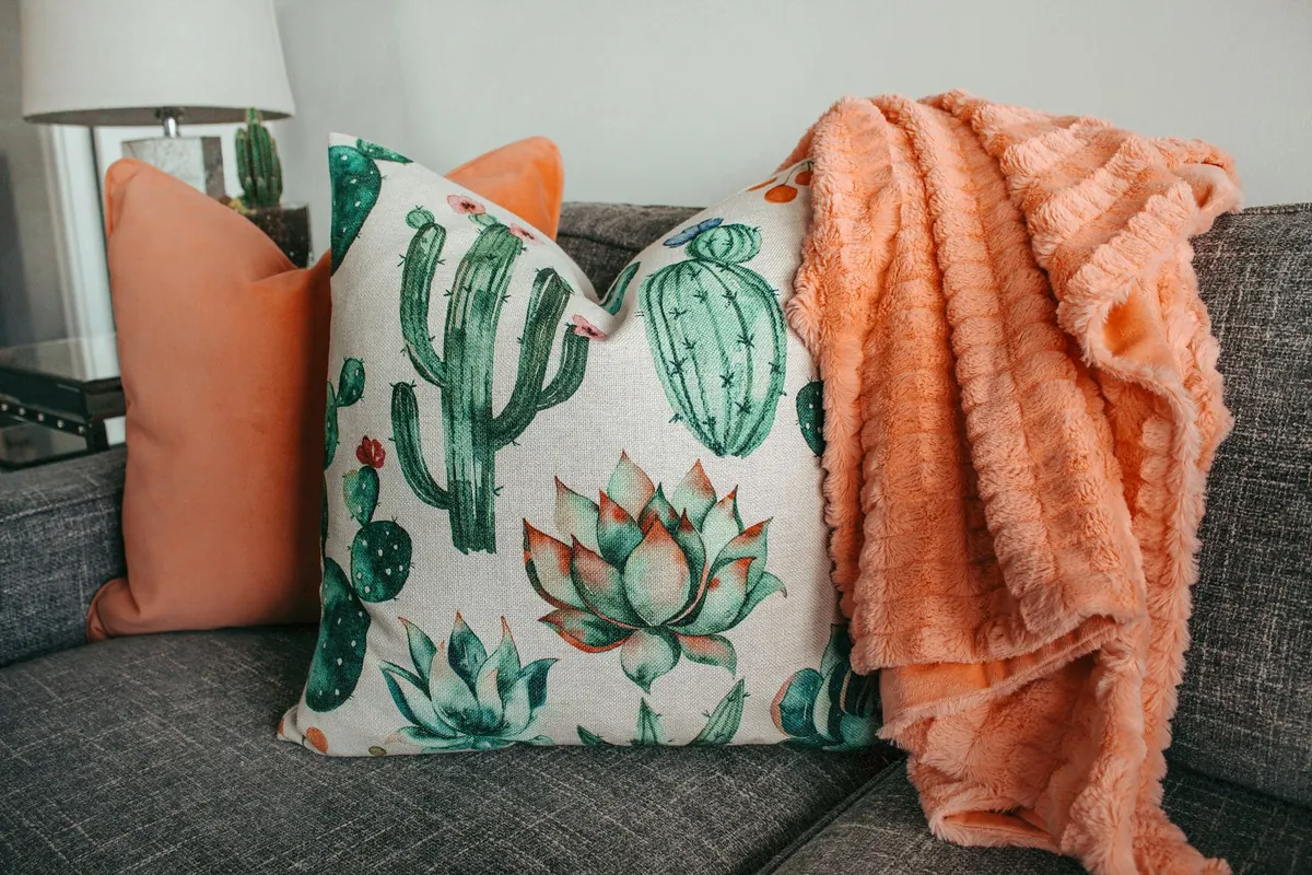
Mixing patterns is where most people freeze. You fall for a striped cushion, then a floral throw, then a checked rug, and before long the room looks like a fabric shop after closing time. Here is the reassuring part: cozy rooms are rarely perfectly matched. They work because of a few repeatable decisions about scale, color, and texture. Once those are in place, mixing stops feeling like a gamble.
Begin With a Quiet Base
Before you add a single pattern, give yourself something calm to work against. A print reads as deliberate when it sits on neutral ground, and accidental when everything is busy at once.
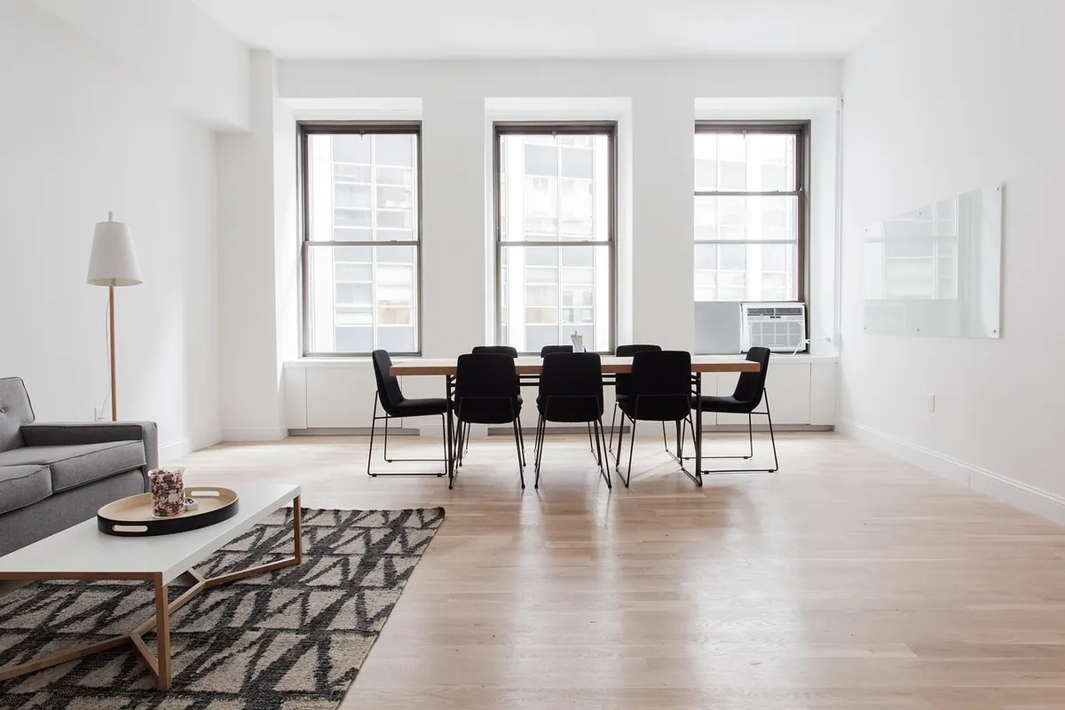
In practice that means walls in a soft off-white, warm greige, or muted clay; a sofa in a solid fabric; a rug that does not compete. Linen, cotton canvas, and wool bouclé all earn their keep here, because they bring texture without pattern. If your sofa is already a bold print, don't repaint the room. Keep the walls, curtains, and rug plain and let the sofa be the only loud voice.
Every cozy room needs a place for the eye to rest. That is the base, and it is doing more work than you think.
Think in Three Scales
Patterns have size, and size is the thing most beginners ignore. Three small prints fight each other. Three oversized prints smother the room. One of each, however, almost always looks intentional.
- Small: gingham, dots, thin ticking stripe, ditsy floral, narrow border prints
- Medium: block print, paisley, medium checks, botanical sprigs, wider stripes
- Large: oversized florals, bold geometrics, big leafy botanicals, wide-scale toile
Judge scale from where you actually sit
Hold a swatch at arm's length, then walk across the room and look again. A print that feels bold in your hand can go quiet from three metres away. Small ditsy prints on a cushion often read as texture rather than pattern at distance, which is useful — just don't expect them to carry the room.
Choose a Color Story Before You Choose a Pattern
Pattern is just color in a shape. If every print in the room shares two or three hues, the motifs can be wildly different and they will still get along.
Give yourself a rough split: one dominant color doing most of the work, one secondary color, and one accent used sparingly. A blue-and-white stripe, a blue-and-green floral, and a green-and-cream check can all live together, because they keep trading the same couple of colors back and forth.
Warm palettes — rust, ochre, cream, faded olive — tend to feel enveloping and are very forgiving of mismatched motifs. Cooler palettes of slate blue, grey, and soft white feel crisper, so they reward plainer textures and a little more restraint. If you fall for a print that doesn't fit your palette, that's usually a signal you want to change the palette, not add a fourth color. Set it aside and decide later.
Texture Does the Cozy Work
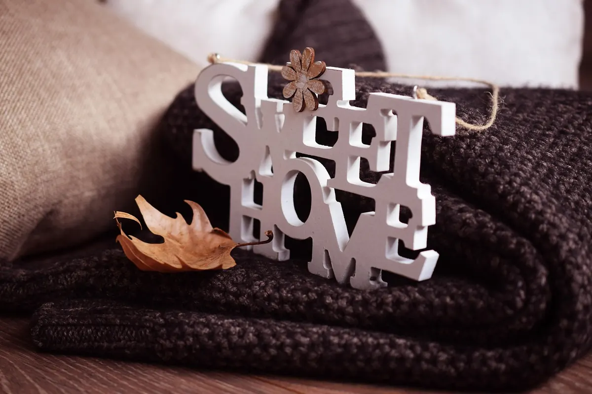
Pattern mixing gets the attention, but texture is what makes a room somewhere you want to sit for two hours with a book. Aim for something nubby (wool, bouclé, chunky knit), something smooth (cotton, linen, leather), something with a little shine (brass, glass, a glazed ceramic lamp base), and something rough or natural (rattan, jute, raw wood).
Texture is far more forgiving than pattern. If you are nervous, limit yourself to two prints and layer in five or six textures instead. Vary the sheen too: matte velvet beside crisp cotton beside a glossy ceramic reads as depth, while five matte surfaces in the same tone read as flat, however many cushions you pile on.
A Simple Layering Method
If you'd rather follow a sequence than trust your instincts on the first try, work in this order:
- Solid base. Sofa, rug, walls, and curtains in plain or nearly plain fabrics.
- Largest pattern where it can breathe. Usually the rug or the curtains — somewhere with space around it.
- Medium pattern at seat level. An armchair, a pair of cushions, a bench.
- Small pattern in small doses. A throw, a lampshade, a tray, a tea towel on a hook.
- Repeat one color three times across the room, in different materials, so the eye can travel.
For cushions, an odd number usually looks best. A reliable formula is three: two in solids, one in a pattern. For five: two solids, two patterns that share a color, and one textured neutral to break the rhythm.
How to Tell When a Room Is Getting Busy
- You can't find anywhere to rest your eye. Remove one patterned item, or swap a busy cushion for a textured solid.
- Everything is the same size. Add one large print and one small one. It's the middle ground that causes trouble.
- The colors seem to argue. Count the hues. More than three and something needs to come out.
- The room looks flat. That's usually too little texture, not too little pattern.
- Nothing relates to anything. Find one color that appears in small amounts in several pieces, and repeat it in three places.
Squint at the room. If it turns to mush, there's too much going on. Taking a phone photo in daylight helps, because a flattened image makes clutter and competing scale much more obvious than your eye does.
Start With One Chair
You don't need to redo the living room this weekend. Pick a single chair and dress it: a solid cushion, one medium print, one small print, one textured throw. Live with it for a week. If it feels good, copy that exact formula onto the sofa, then the rug, then the curtains.
Cozy is not the same as coordinated. A room that's slightly mismatched, well worn, layered, and clearly loved will always feel warmer than one that matches perfectly and refuses to be sat in. Move a cushion if it's wrong. Move it back tomorrow. That's the whole method.
Photo: Designecologist / Pexels